Range Rover is switching things up. As the luxury SUV brand gears up to launch its first fully electric model later this year, it’s revealed a sleek new logo designed with Gen Z and modern minimalism in mind.
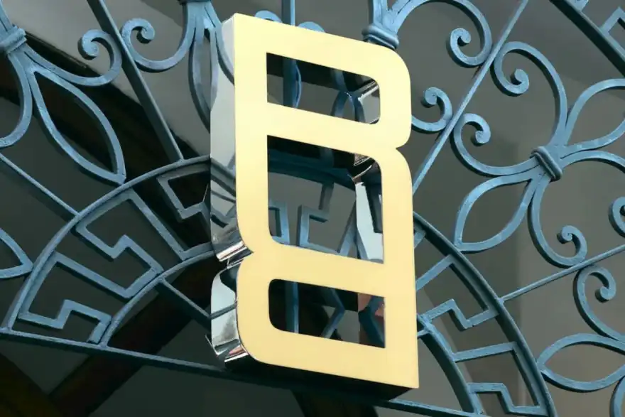
Unveiled during a recent investor presentation, the new symbol features two stylised "R"s in Range Rover’s signature wide-set font. It’s actually the first time the brand has introduced a new emblem since its debut back in 1970.
But don’t worry, this isn’t replacing the iconic 'Range Rover' text that’s always been front and centre on the cars. JLR (Jaguar Land Rover) says the new logo is more of a flexible design piece, made to be used in places where the full script doesn’t fit such as labels, event branding, or even subtle patterns on merch or interiors.
This all ties into JLR’s new House of Brands strategy, which splits its core lines into their own standalone sub-brands. Range Rover, Jaguar, Defender and Discovery each now have their own unique vibe, marketing, and direction.
Jaguar already teased its new look earlier with the Type 00 concept. Range Rover’s just dropped theirs. Now we’re waiting on Defender and Discovery to show off their fresh branding.
So what about the Land Rover name? It’s not disappearing. Instead, it’s being repositioned as a trust mark, essentially a quality stamp for the tech and off-road capability that still underpins all JLR SUVs. CEO Adrian Mardell was clear: “[Land Rover] is still integral to our business,” and its name will stay visible on cars, websites, and showrooms.
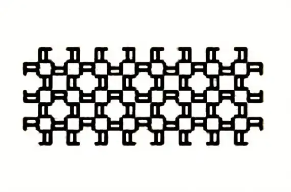
The new Range Rover logo was also shown as part of a checkered Range Rover pattern, with the stylised R design woven in. It’s not clear yet where this pattern will show up, possibly the grille, interior trim, or even fashion collabs, but it's definitely a play to give Range Rovers their own identity separate from Land Rover’s mainstream models.
One thing’s for sure. Range Rover is leaning into luxury and individuality as it heads into its electric future.

