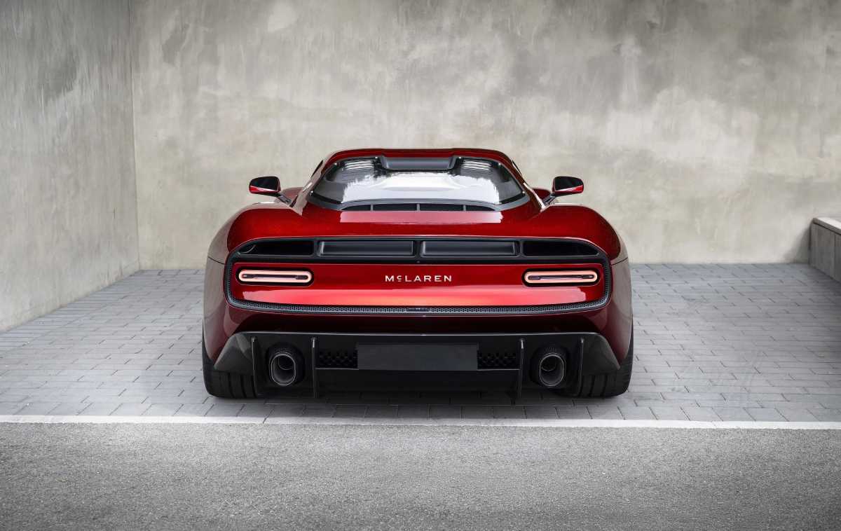
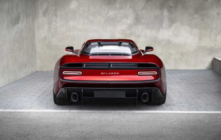
McLaren has unveiled a new logo and wider brand identity as the British marque looks towards what it describes as its next chapter.
The updated design brings McLaren Automotive and McLaren Racing under a more closely connected visual identity, with the company drawing heavily on its history while preparing for an expanded future.
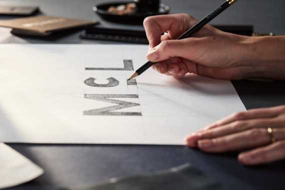
The biggest change is a new McLaren wordmark inspired by the lettering that appeared above the family service station in Remuera, Auckland, New Zealand.
That location belonged to Bruce McLaren's parents, Les and Ruth, and played an important role in his early interest in cars and engineering. McLaren says the new design reconnects the modern brand with those origins.
McLaren logo and new brand identity
The familiar McLaren Speedmark is staying, which should make the change feel less dramatic for fans of the brand.
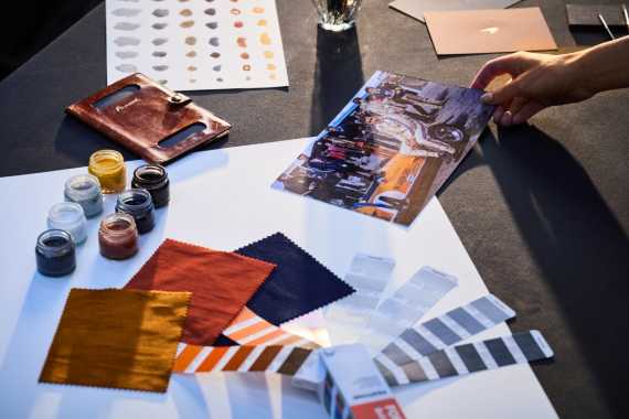
McLaren says the Speedmark remains an important part of its identity, while the new wordmark takes a more prominent role across the company. The identity also retains the Speedy Kiwi, alongside an expanded colour palette built around different moments in McLaren's history.
The change comes after more than six decades of McLaren evolving its visual identity. The Speedmark itself has been part of the marque since the late 1990s, with earlier versions of the McLaren logo featuring the Kiwi and other designs.
McLaren's new design also introduces a bespoke typeface called McLaren Sans, which is intended to give the brand a consistent appearance across cars, merchandise and digital platforms. Autocar reports that the company's signature papaya orange will become more closely associated with McLaren Racing, while darker colours will play a greater role across the automotive business.
Why is McLaren changing its logo?
There's more going on here than a fresh bit of corporate artwork.
McLaren is entering a period of expansion, with the company looking to broaden its range beyond the two-seat supercars that have defined its road-car business for years. The brand has already revealed the McL 6GT and has confirmed plans for further models, including a performance SUV.
McLaren has also announced plans for a £500 million investment programme covering its UK manufacturing and engineering operations. That forms part of a wider push to grow the business and its future model range.
So the timing of the rebrand makes sense. McLaren is trying to create an identity that can cover a much bigger business than the one most people associate with its current supercars.
What does McLaren say about the new design?
David Woodhouse, chief creative officer at McLaren Automotive, said the company wanted the new identity to reflect its history and the direction it is taking.
He described the new look as an expression of the ambition and creativity shaping McLaren's future.
Lou McEwen, McLaren Racing's chief marketing officer, also said the identity connects the company's heritage with its future ambitions and described it as feeling "unmistakably McLaren".
That's important because McLaren has plenty of heritage to work with. Bruce McLaren founded the racing team in the 1960s, while the company later became a major name in road cars following the arrival of the McLaren F1.
The new identity is therefore deliberately looking backwards and forwards at the same time.
McLaren's new logo verdict
I think this is a sensible change for McLaren.
The new wordmark is distinctive enough to give the brand a fresh look, while keeping the Speedmark means the company hasn't thrown away one of the symbols people already associate with it. More importantly, the design arrives at a time when McLaren's business is changing considerably.
The real test will come when the new identity starts appearing across a much broader range of cars. If McLaren moves successfully from specialist supercar maker towards a wider performance-car brand, this logo could end up marking a significant point in its history.
For now, though, the important bit is simple. McLaren has changed its face, but it still looks unmistakably like McLaren.