Audi has launched its eye-catching Q8 e-tron which is the latest stylish electric model from the German powerhouse – which is arguably leading the way when it comes to the design and performance of electric vehicles worldwide.
The SUV is priced from £67,800 OTR comes with a driving range of up to 343 miles and is also available in coupé-inspired Sportback style.
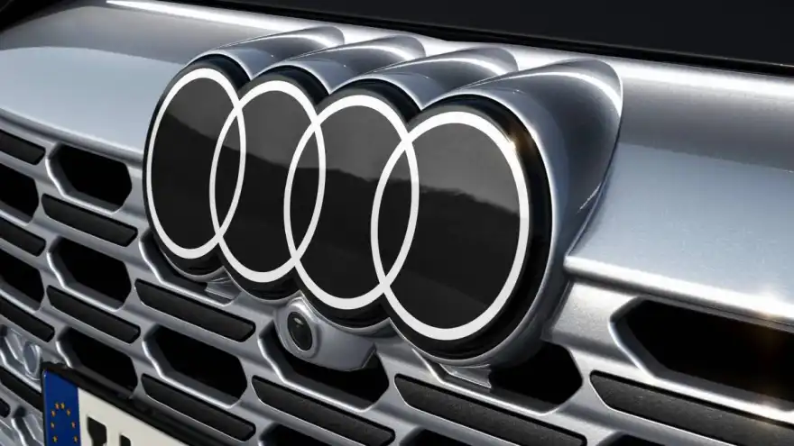
But aside from the spectacular Q8 itself, this is also a milestone for Audi as it’s the first model to carry the new logo.

Many of you, I’m sure, will be asking; ‘what’s changed?’. Others will notice that Audi has become the latest in a long line of brands globally that have simplified their logos with this latest edit being a flat black and white design that has lost its shiny bevelled appearance.
VW simplified its own logo back in 2019 whilst Toyota, Nissan and KIA have done the same over the last few years.
Away from the automotive industry, a whole host of sports teams have been doing the same over the last decade or so as have household brands such as Burger King, Pringles and Warner Bros.
Audi’s new logo was revealed by brand strategist, Frederik Kalisch, who called the design "on one hand, loud and very bold, and on the other, the restrained, pure, and clean," while André Georgi says, "The new two-dimensional look gives our rings a significantly more modern and even more graphic makeover, although their geometry is almost identical to the former ones."
Are you a fan? Let us know in the comments below.
Ever wondered what the Audi engine badges mean - here's your answer.